(Joe Wright, 2007)
Produced by Working Title (+2); distribution: Universal
Budget:$30m
Box Office: $130m (world); $51m (USA), £11.5m
Fledgling writer Briony Tallis, as a 13-year-old, irrevocably changes the course of several lives when she accuses her older sister's lover of a crime he did not commit. Based on the British romance novel by Ian McEwan.
Universal Pictures ident denotes the distributor.
The font is serif which could connote a setting in the past, it could also signify a serious drama as the font and background are black and white.
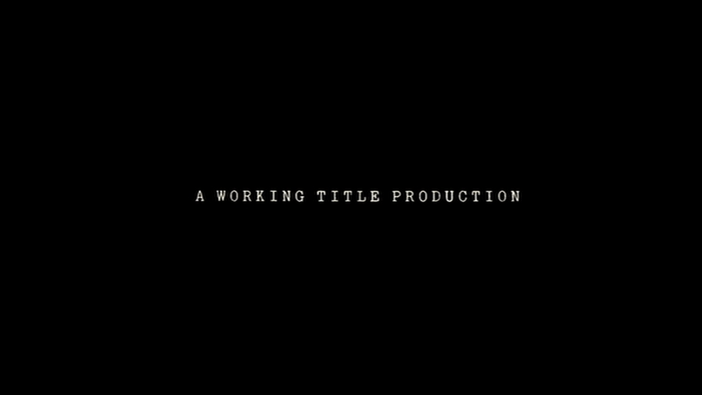%2Ba%2BWT%2Bprodn%2BMAIN%2Bproducer.png) |
| This denotes that they are the main production company. |
%2Bshot2%2Bpan%2Btrack%2Bround%2BCU%2Bof%2Bhead.png) Then we see a close up panning tracking shot of the girls face, followed by an extreme close up of her eyes to show her lack of emotion.
Then we see a close up panning tracking shot of the girls face, followed by an extreme close up of her eyes to show her lack of emotion.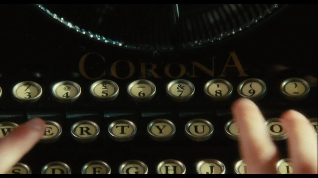%2Bshot4%2BHA%2BPOV%2Banchors%2Btypewriter%2Bas%2Bdiegetic%2Baudio%2Bbridge.png) |
| This point of view shot connotes this little girl to be the main central protagonist. |
%2BUni%2Bident.png)
%2Btitle%2Bmain.png)
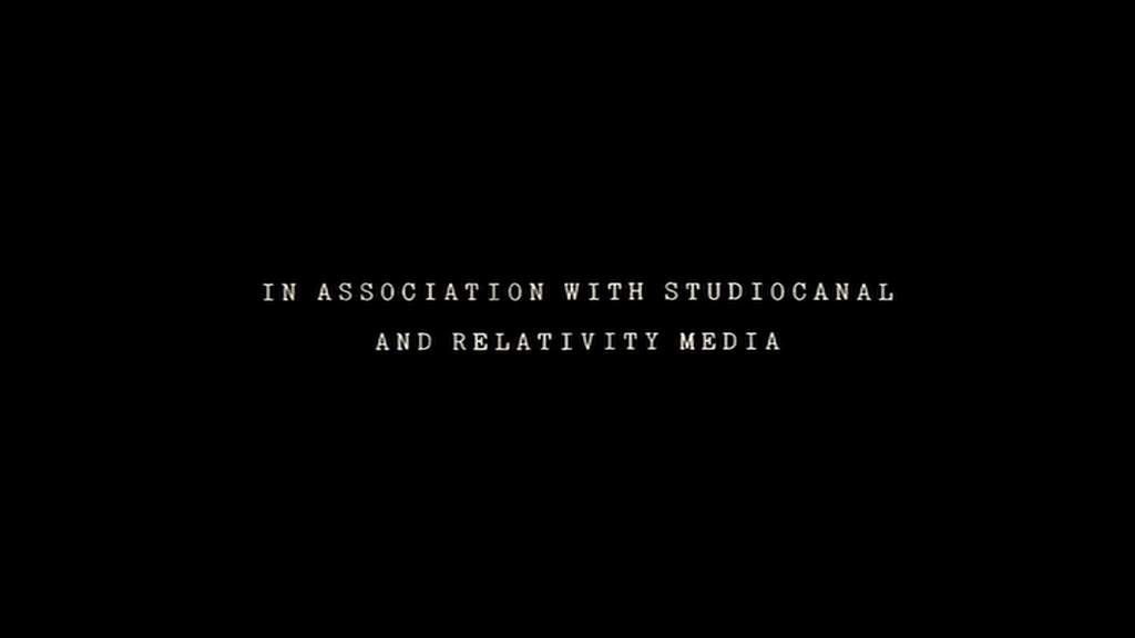%2Btitle%2Bin%2Basstn%2Bwi%2BCo-production.png)
%2Bpomo%2Bparody%2Bof%2BES%2Bwelath%2Bera%2Bchild%2Bsigs.png)
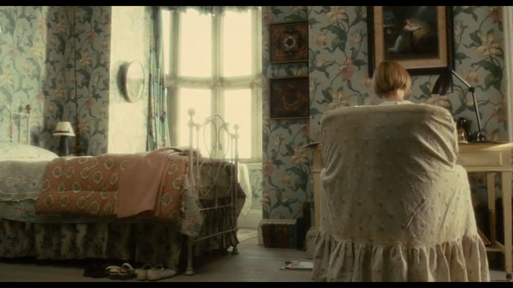%2B1st%2Bnarr%2Benig%2Breframe%2Bon%2Bgirl.png)
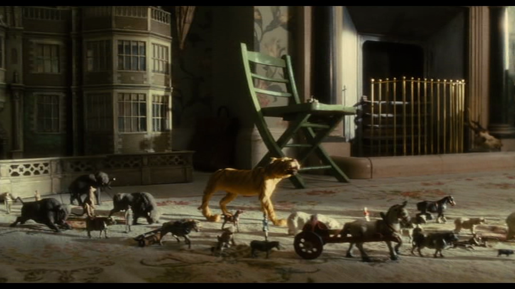%2Bpan%2Btrack%2Bwelath%2Btravel%2Belephant.png)
%2Bshot3%2BECU%2Bon%2Beyes%2Bbut%2Bno%2Bemotion.png)
Good work generally - lots of media terminology, tho' try to colour highlight this! - but some points to develop:
ReplyDeletealways look out for small text; its the default for captions which is usually ok, but not if the main text is actually the captions!
the pan/track isn't a master shot: that occurs when you've had some parts of a location in shots THEN get a (master) shot revealing the full location
the ECU isn't used in quite the way we expect - can you say why?
the opening shot is always a key one to analyse
copy/paste the top of my post so you have a better-formatted heading/sub-headings and can use this as a template for other posts analysing film openings (copy/paste it again, and just change words/links each time! no need then to spend time changing size/font/colour!!!)
I highly recommend adding tags too - ask if unsure about this or anything else