Showing posts with label Titles. Show all posts

Tuesday, 14 April 2015

MAIN TITLE: the font used

Candelabra title
I wanted the font of our film to signify the rom-com aspect of our hybrid genre. Therefore I decided upon the font brush script as it is a sans serif font which is curled signifying a playfulness therefore suggesting the comedic aspect of the film. However the black and white colouring connotes the social realist aspect the the genre as it is more serious. 


Inspiration 
I was inspired by the title from 'Grease' as it's is also curled and signify the films romantic and comedy aspect however the red specifically connotes the romantic part of the film but instead I have used back and white to show the more serious nature of our film. 

Thursday, 19 February 2015

SHOOT 3: Tiles research, Mickybo and me, Love actually


Examples of titles we have researched


The titles in Mickybo and Me are all very 
simple which is typical of a social realist
 film. It is also a sans serif font which signifies 
this further. The spacing in titles is also 
significant as they are irregular connoting 
childishness which fits with the film well.


Also this title by saying 'introducing' shows that it has new actors in it as typical social realist films don't have well known actors in them.

In Love Actually the shot then 
fades into the title page. This 
font and colour is significant 
because of it colour and boldness
 it signifies a romantic comedy. We
 can tell this as usually a different bright
 colour is used to connote comedy and
 the boldness and sans serif font signifies
 romance.

Wednesday, 11 February 2015

SHOOT 3: Title research, ordering

The Ordering of titles
I found that there is a specific and correct way of ordering the titles within the main sequence, before this research I had no knowledge of the ordering and didn't think there was one. So this research has helped me to understand the basics and develop my knowledge of film openings. 

  • The film first introduces the film production companies and main ident in this case Warner Bros
  • Then the central (A-list actors) protagonists actors are introduced
  • Then other key roles such as editing, casting, music and costume are introduced
  • Then the producers 
  • and finally the director who is introduced rather informally as this fits with the non-serious genre of a rom-com by the introduction 'Produced by' 

After looking on http://www.artofthetitle.com I found You've Got Mail's opening title sequence in this order.


I will now compare these to previous title researches and then use this sequence to help me order our titles. 


SHOOT 3: Titles research

Research
I also looked on artofthetitle.com. I found many different fonts used in title sequences

I really liked Fargo's font sequence as it like ours uses type over scenery as well as the interesting use of spacing between letters. I used this is our first rough cut.


These inspired me to try out different spacing between lines, words and letters.


In this I used spaces between letters


In this I used spaces between words


Again I used spaces between letters


In this I used spaces between the lines and words


However after analysis You've Got Mails tiles I also used their technique of making the name of the concerning person bold. Also You've Got Mail is a rom-com and their font used is very similar to ours, therefore this may signify that our film's genre is also a rom-com.


I made the concerning party's name bold to highlight their name

SHOOT 3: Titles experiment planning

Titles
In an effort to try and help us to decide upon a font for our titles I used many different fonts in the rough cut so we could compare. However because each were in different shots we couldn't make a fair comparison. So next I will use one shot and use many different fonts on that one shot. I will also ask an audiences opinion on which font they prefer and why using a questionnaire. To find some different fonts I will look on a downloadable font website called Art deco due to their range of retro fonts which would fit our quirky main characters persona. 

Wednesday, 26 November 2014

GENRE - ROMANCE CONVENTIONS: Heathers, Rushmore, Girls just want to have fun, She's all that

I have looked at the films:
Heathers
Rushmore
Girls just want to have fun
She's all that 

Key features in each film that stood out for me were these:
In 'Heathers'
 Character- One of the lead role, played by Christian Slater, is the 'bad boy' which is a dangerous character who is usually very handsome, dressed in black, riding a motorcycle and bad influence whilst also being disruptive at school. Other common features of a bad boy are that they smoke, drink, have a husky voice and swear. 
Costume- The clothes worn are the fashionable clothes of the 1980's. These could influence our main character as she will be wearing retro vintage clothing, consisting of oversized blazers with large shoulder pads, bright block colours or complex patterns, tartan and tennis skirts. This could also link to make-up as they have distinctive bright eye make-up on when going out and volumed curled hair.


Titles- The 'produced by' is in swirly curled writing typical of a romantic film and shows that this film is focused more at a female audience. The names are all in blocked white and red font which shows that it is a high school film. The wording is quite formal as they use the phrase "produced by" rather than "made by".

 'Rushmore'

Titles- The text position moves around the shot which looks vey affective as it also changes colour depending on the background it is placed. Also the colour varies from white to black but the main title is a bright red which looks very effective whilst also connoting that the film is a romantic or romcom film

 Mise-en-scene- The headmasters room contains a lot of dark wood and leather furniture. This isn't the exact style of furniture that we would go for but the full packed and obvious mise-en-scene is what our room will be like. 


Shot types- one of our shots maybe of a book showing the name of our chosen male protagonist so this type of shot is very effective as it uses the rule of thirds. 
 Also this shot of a newspaper that would also link to mise-en-scene relates to our film as we wanted our male protagonist to stand out as being an individual and him holding a newspaper would clearly show that. 

'Girls just want to have fun'

Titles- The font is bold and a bright orange colour stereo typical of rom-coms. Used the phrase "directed by" but not a "Alan Metter film".


Mise-en-scene- This retro Tv would fit with or retro style of mise-en-scene.
Costume- The outfits worn were typical of youths in the    80's again.

'She's all that'

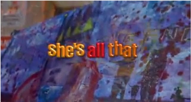
 Titles- Again the font is brightly coloured using the most popular colours of a rom-com orange, yellow and red. This time the text is rounded and smooth but still bold.
Characters- As our female and male protagonists will be outcasts the main female character in 'She's all that' is a perfect example as you can tell immediately that she is a quirky individual. (Costume + Props + Make-up) This is shown by her holding art pads and paints when walking around school whilst also wearing glasses with messy tied up hair, no make up and ripped dungarees with brightly coloured teeshirts that gave her a tomboy look. The male character in 'She's all that' is a stereo typical posh popular boy like in 'Pretty in Pink' (Costume) he wore plainish clothes like jeans and tee-shirts as well as a varsity jacket. We may cast a character much like this as a love interest