(Shane Meadows, 2007)
Produced by Warp Films (+6); UK distribution: Optimum Releasing
Budget:$1.5m
Box Office: $329,37 (domestic); $7,847,165 (foreign)
A story about a troubled boy growing up in England, set in 1983. He comes across a few skinheads on his way home from school, after a fight. They become his new best friends even like family. Based on experiences of director Shane Meadows.
We then see a long shot of a young boy sitting upon bed. It is now clear that this is defiantly not an American film as this is not relatable due to the very unglamorous setting and cubby ginger youth wearing dirty Y fronts which we would now presume to be the main character as he the first few moments are centred around him.

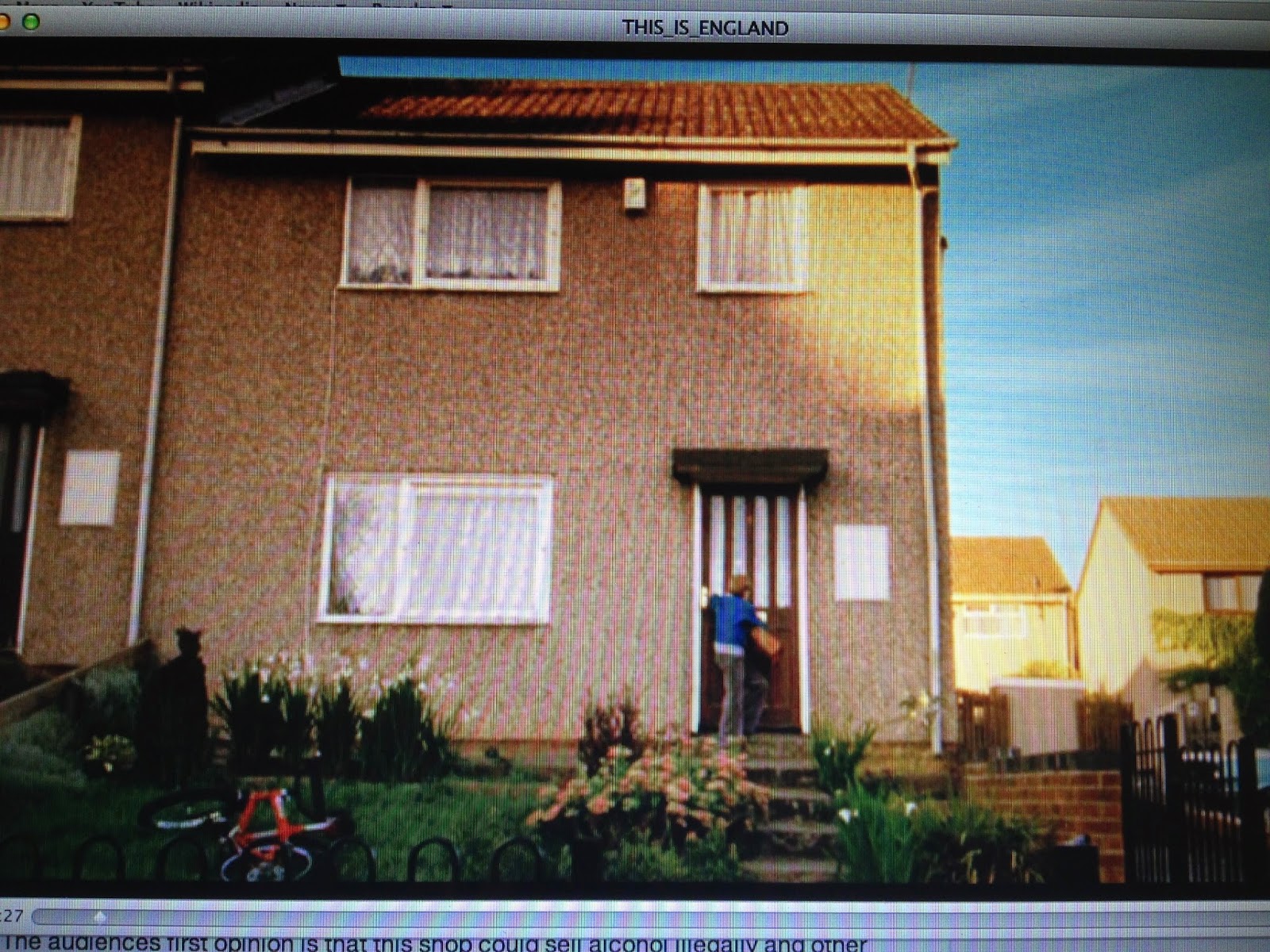
Then we are finally presented with the establishing shot where the setting is finally revealed. The semi-detached house is situated in a council estate but in the bottom left hand side of the frame we can see a bike left untouched on the front lawn, this signifies that even though we would associate council estates with theft this must be a relatively safe area which contradicts general stereotypes.
This is then followed by an extreme long shot showing a slightly run down looking news agents. The audiences first opinion is that this shop could sell alcohol illegally and other dodgy items.
A panning shot follows the boys movements whilst also revealing the interior of the shop, this is so the audience can see that this is just an ordinary news agents.

 Then we see a medium point of view shot from both the boy and the shop owners perspectives. Both characters are placed in the right hand side of the shot this is so we can clearly see both characters facial expressions and surroundings.


Wow - at this early stage of the year. this is basically excellent! 'Use of Terminology' is only 10/50 in the exam, but kinda underpins everything - you've provided loads here. When you do, that usually means 'EX' (use of examples; denotation) is strong, and it is. The EAA, just like Maths, needs to have evidence (EX) to back it up, and you've done that well too
ReplyDeleteJust watch spelling: mise-en-scene (3 words, hyphenated as one); definitely, not defiantly (a very common error!)
Brilliant start, well done ... BUT you must get into the habit of always illustrating blog posts with relevant screenshots or other appropraite imagery, and hyperlinks where you can - you need to add these to this post
My previous comment - still not published I note - praised the use of terminolgy, but, as was the focus of the last lesson, I expect illustrative screenshots, work on layout - with key film info at the top as per my examples - and some relevant, even if basic (IMDB or Wiki for example), hyperlinks included.
ReplyDeleteYou'll realise when you get to the Evaluation (20%; 10% = 1 grade!) that screenshots are vital, so you can dramatically reduce your workload now by ROUTINELY including these in blog posts
If possible, try to highlight terminology by using bold, pink (you've used Italics). This means that even if an examiner skim-reads your blog they'll note the frequent use of this
ReplyDelete