(Richard Ayoade, 2011)
Produced by Warp Films (+9); UK distribution: Optimum Releasing
Budget:$1.2m
Box Office: $467,602 (domestic); $397,057 (foreign)
At the moment i'v been looking into the first few minutes of films. It interests me that the first few moments of a movie can either make us press the stop button on our remotes or entice us into exploring what more the film has to offer. This means that the most crucial part of a film may well be the first 2 minutes. Therefore it must be done correctly.
My reaction to the first few moments of the film 'submarine' was this, many different variations of camera lengths and angles were used which added to the scenes visual appeal and made it more interesting.
 The colour scheme created an arty feel which I personally loved there was minimal dialogue which I thought was effective due to the arty feel of the opening, it made me feel as if I was watching a short film that should be shown in an art gallery.
 Even though it's hard to make clear what genre the film is in the first few minutes of it, (especially rom com) this film portrayed it perfectly by not making it incredibly obvious but enough so that I could say that the film would be a rom com. They did this by adding an arctic monkeys backing song about romance
finally one of the main things that stood out for me, even though it may seam insignificant, was the voice over, not only was it spoken with a dulsit tone which matched the feeling of the room but also that it matched the feeling of the whole 2 minutes, very simple and very effective. Even the camera angles at one point were so simple they almost looked amateur but it just fit even though the piece isn't amateur but very stylised and beautiful.

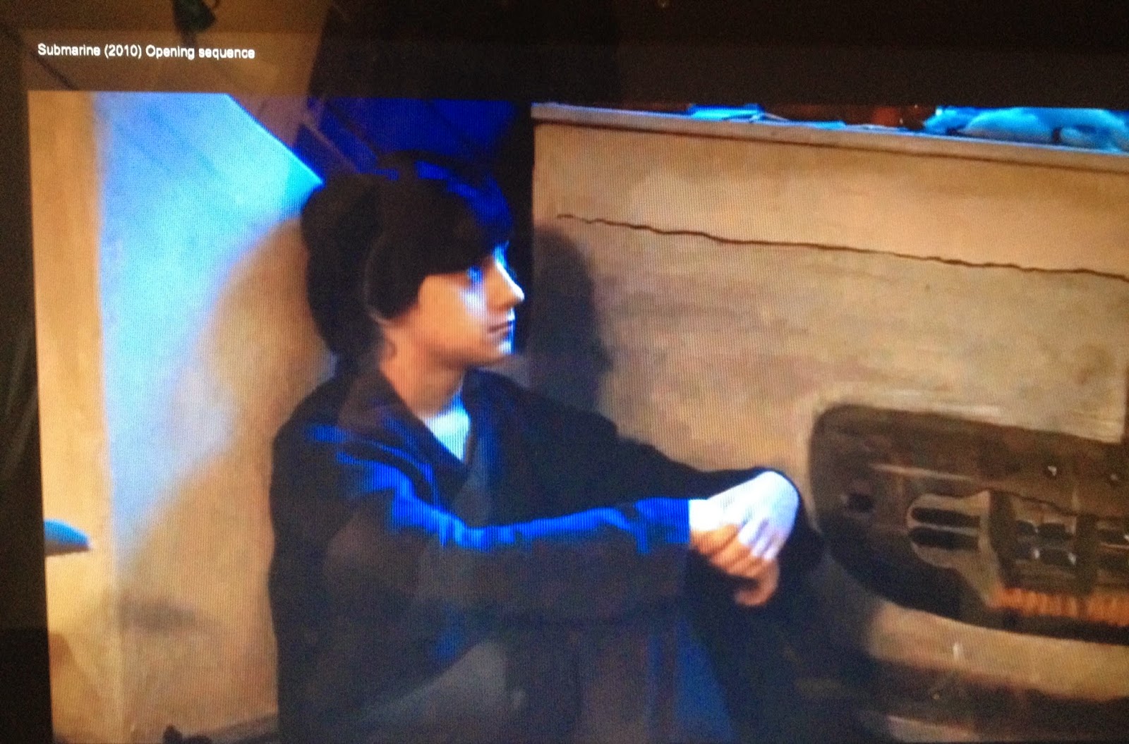
Here the camera is panning across the room to give us the audience an idea about the character and their surroundings. This is showing us that this is not the bedroom of a stereo typical boy as it looks like an old mans bedroom.


needs screenshots to illustrate the points made
ReplyDelete